
An app designed to reimagine legal language in laws to make it clear, accessible, and understandable for everyone, regardless of someone's background, education, or familiarity with legal concepts.
StatuteSimplifier
Role
UX Designer, UX Researcher
Timeline
June 2024 - November 2024 (Capstone 1)
Industry
Law
Platform
Mobile, iOS
Tools
Sketch

Problem
Layman’s struggle with understanding laws, even basic laws. The reason behind this stems from how lengthy and complexly worded laws can be. Those without legal knowledge struggle to understand what each law means, how they are used, and how it affects them.
Solution
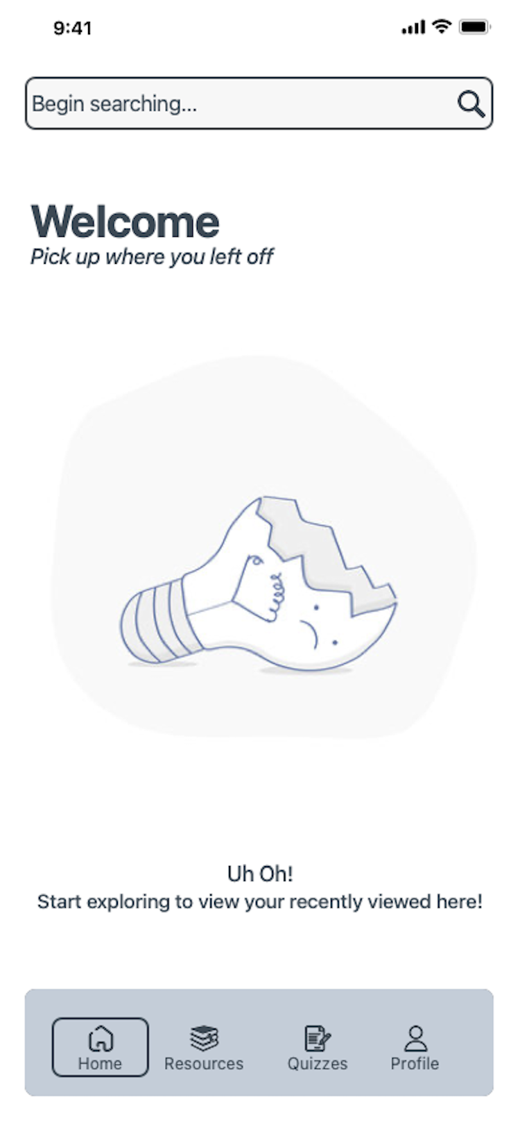
Developed an app centered around a search bar designed to deliver fast results. Users can choose to view the full text of the law they search for or access a simplified version without legal jargon, making it easier to understand and saving time. To enhance users' knowledge and confidence, the app includes quizzes that allow them to test their understanding of the material. Additionally, for visual learners, the app provides images directly related to the law being searched, offering a more engaging way to grasp the content.

The Goal
Create an app that would shorten laws, use minimal legalese, provide examples, and use comprehensible charts, graphs, or images to simplify laws. Users of the app should have an understanding of legal concepts and laws so that they can make informed decisions, develop confidence and empowerment within themselves and enhance their communication and negotiation skills in settings where having an understanding of the law would prove beneficial.
Design Approach
-
Discover
1. Secondary Research
2. Personas
-
Design
1. User Flows
2. Sketching
3. High Fidelity Mockups
-
Validate
1. Testing
Stage 01. Discover
Research
Conducted secondary research to broaden my understanding and highlight knowledge gaps.
Insights: Learned that the problem I am exploring is universal and faced by many. I read Linkedin Learning articles, blogs, and reviewed research done by MIT researchers and articles written by various bar associations to better understand the problem. I confirmed that both laymens and lawyers have difficulty with laws whether it was due to how lengthy they are or their complexity.
Secondary research also highlighted numerically how much of the general public did not understand the law due to its complexity and their unfamiliarity with it— in turn making them feel unprotected and confused.
Personas
In order to understand who I am designing this product for, I created personas that focused on users' behaviors within the context of them using the potential app. I learned the motivations, needs, and pain points of my target users.
The two personas I created:
“Average Joe” (the general public)
“Mindy the Law Connoisseur” (those with a background of some sort in law)


Stage 02. Design
User Flows
User flows were created to visualize the routes my user might take to achieve a goal of theirs.
The most critical routes - Red Routes, are essential to defining the key actions that directly impact my user's success.


Red Route 1 - Users need to create an account to access the app and use all of its features.
Red Route 2 - Users need to search for a law (s) to begin understanding the law.
Sketches
I created the below sketches of my red routes to begin visualizing how I wanted my product to look on a mobile platform (I also conducted some quick usability tests with these screens).


Stage 03. Validate
Testing
To test the usability of my design, I interviewed 5 participants who matched my target audience.
Some of my key takeaways were as follows:
Pain Points
Some chose to use the “U.S. Laws” icon but did not know how to use it causing them to back out of the page and force them to use the search bar instead, therefore U.S Laws icon was removed.
Success Points
Search bar was favored and easy to locate
Suggestions
Include dropdown suggestions
Learnings
After users tested my prototype, I knew I had to make immediate improvements before I submitted my screens because there were critical errors such as an unused U.S. Laws icon that needed to be entirely removed from the menu. Other critical and minor changes were also made, but this showed me the importance of testing repeatedly to ensure optimal success.
Throughout the project, I also learned the importance of fully understanding my users frustrations above all in order to develop the best and most valued solutions.